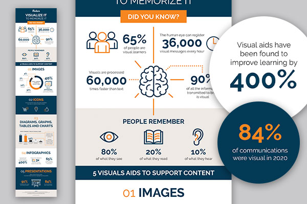
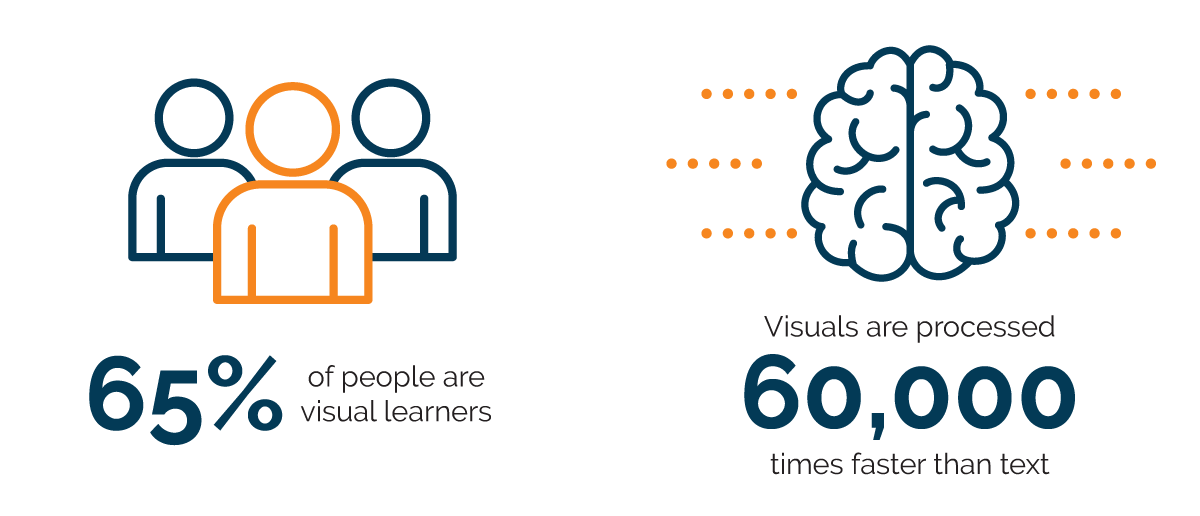
In school I would read books, but I would not retain the information for long. I noticed that I remembered material better when I saw it, whether it was an image or a diagram. When I realized that I was a visual learner my world became much easier. That’s why I enjoy being a designer. As a creative I get to take information and transform it into visuals for audiences to understand. Did you know that 65% of people are visual learners1? Consequently, getting your message across with just words may not be the best solution for a world that is so visual. Since we can process visuals 60,000 times faster than text,2 incorporating visuals along with copy can help you communicate more effectively.
Images
We all know the saying “A picture is worth a thousand words.” This is so true. Using imagery can express your message and tell your brand story in ways that words simply can’t. So, when choosing stock photography, make sure that it aligns with the tone, personality and look of your brand.
Icons
An icon is a visual symbol of an item, concept or idea. We see icons everywhere – on our computer, on our phones, at the store, in airports… the list goes on. Icons might be small designs but can have a big impact on communicating information without using words. They should be easy and quick to identify. The great thing about icons is that they can be stylized to match your branding. I recommend using only one to two colors in icons to keep them simple.
Diagrams, Graphs, Tables and Charts
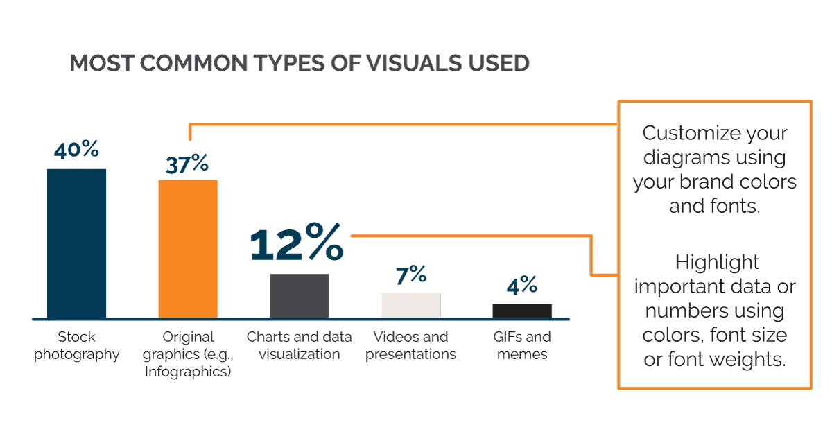
Have you ever viewed data and felt overwhelmed by all the words and numbers? The trick is to present data in an easy-to-understand format that’s also engaging – data doesn’t have to look boring! Customize your diagrams using your brand colors and fonts. The fewer words, the better. Highlight important data or numbers using colors, font size or font weights. You can even incorporate icons with the visual to make it more engaging.
Infographics
An infographic is a visual representation of information or data in a striking way. Infographics are a great way to take complex data or research and make it easier to digest. Many infographics incorporate the visual aids previously mentioned.
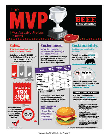
This Most Valuable Protein – Retail3 infographic from Beef. It’s What’s for Dinner.® is an example that uses a variety of visual elements to support the copy. Icons are used to quickly identify categories, while color and font size/weight emphasize important messaging and stats. The use of illustrations further complements the data.
Presentations
As technology advances, the human attention span gets shorter. We are constantly overloaded with information and continuously scrolling through feeds. So how can you keep your audience engaged during a presentation? More visuals, fewer words. Using visuals during presentations can help your audience not only process the information faster but retain it better. Don’t overcrowd the slide with too much material. Additionally, minimize text by using short bullet points to highlight your key points instead of long sentences and paragraphs. Here’s where images, videos and graphs can shine. Remember 65% of people are visual learners, so use this to your advantage.
What would a blog about visuals be without a visual takeaway? Click the link below to download an infographic that summarizes this blog.